Olive Design

First lamp show of 2014

Comments Off on First lamp show of 2014 Written on May 28th, 2014 by
Categories: Decorating Ideas, Neighborhood Notes, Olive Design
Tags: , , , , ,

Mary Olive Design: Unique Lighting

June 8th, 2014 12pm – 4pm

209 Westminster Road, Brooklyn, NY 11218

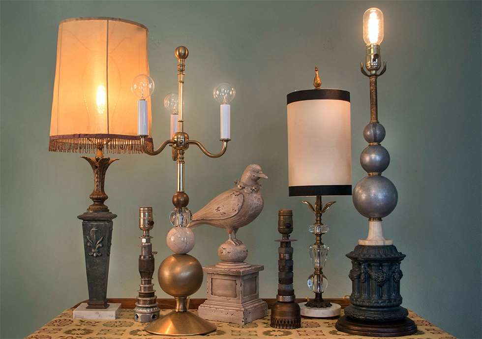
Join me at my home studio, and browse my collection of lamps, lovingly handmade from salvaged, vintage, and repurposed parts. Each one has been carefully considered and crafted for beauty and balance.

Featuring a trunk show of works on paper by Katie VanVliet, a printmaker from Philadelphia, PA. You can preview her work at www.katevanvliet.com.

Many of my lamps are available to preview on my Etsy shop, and many many more will be unveiled during the show!

Silk Purse/Sow’s Ear

Comments Off on Silk Purse/Sow’s Ear Written on March 11th, 2014 by
Categories: Decorating Ideas, Olive Blog, Olive Design, Olive Green
Tags: , , , , ,

Curbside or thrift shop treasures while a bargain, usually lead me to the question- will I ever really fix this up to use it?   It depends on the level of decreptitude- or for me, if it’s the exact size piece I need for the space, and if its basically a better piece of furniture than I can buy cheaply.  While my kids hated the groovy painted furniture I put in their rooms and pined for Ikea almost-wood, I prefer a solid piece of real wood furniture in a classic shape and solidly built.  I can see past the peeling paint and occasional dangling part to what it could be with a little elbow grease.  But filling the space requirements is usually what tips me into actually doing the work on it.

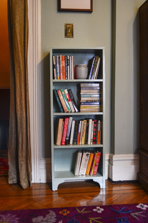
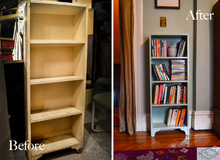
My latest rescue was the perfect sized bookshelf for my bedroom, when my excess books were stacked in front of the radiator and collecting dust on the floor. It was old, had a gazillion coats of paint, some peeling and the front leg was cracked.

Before you do anything, take off any paint that looks like it is ready to jump ship anyway, using a spackling knife rather than a scraping tool, so you don’t pull up tight paint- I didn’t want to strip it (way too much work for this piece) but if you have any notions that new paint glues down peeling old paint, disabuse yourself of that idea.  It usually means your new paint will soon come off as well.  Top coat is only as secure as the bottom layer.
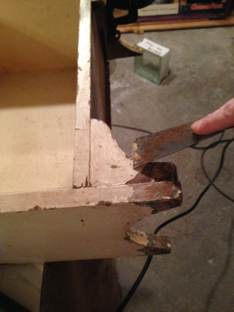
After the removal of loose stuff, take a sander to it- it will smooth down the previous layers, some of the brush marks and let you know where drips are that you haven’t noticed.  Sometimes I help those off with a sharp razor.
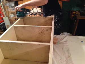

Orbital palm sanders are cheap and easy to use, they should be  a part of any handy-person’s tool collection.

Fix the busted leg- I use an old your-name-here credit card that comes in the mail every day with new card offers, its just the right thickness to work the glue into the crack.
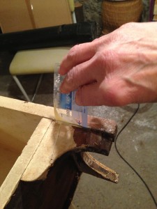

I use clamps to hold it in place while it dries, and glued a block into the corner behind the leg to give it more stability.  Cut the block down so you can’t see it from the front.  I clamp the leg so the glue can set.

Then predrill a hole, and run a flat head screw into several points to give it extra strength and stabilize it.
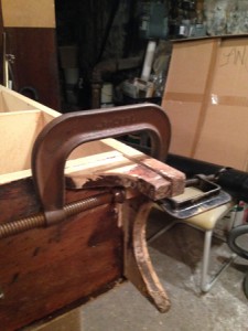
If you have the bits, its nice to counter sink the hole (a wider hole at the top to accommodate the flat screw head) so the screw isn’t noticeable, you can fill the top with compound to make it invisible. This fix it step took about 20 minutes, and now I don’t have to worry about the leg cracking off, and the fix is invisible.

For the paint job, I use the same type of paint, in this case oil-based.  I prefer alkyd paint for furniture anyway, as its tougher, but always best for paint adhesion to stick to the original paint type. For my color, I mixed some leftover oil based paints, to get something fairly close to the wall color.  I want the bookcase to blend in, not stand out.  If it was a more interesting accent piece I might have gone with a bolder color.

Once it’s done and in place, I’m glad I took the time!
 

For all the pinners out there:
Recycled Lights

Comments Off on Recycled Lights Written on June 6th, 2012 by
Categories: Decorating Ideas, Olive Blog, Olive Design
Tags: , , , , , , ,

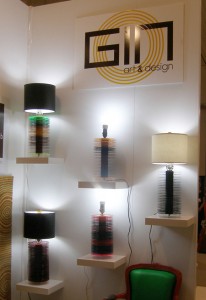
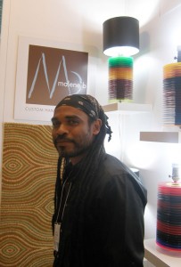
One of my favorite pieces from the ICFF show was the lamp made from recycled 45”s by GIN Art and Design. I liked the great colors and repurposing of the original material.  GIN Art & Design was founded by Orlando Dominguez (pictured) and is based here in Brooklyn.  There was some really cool stuff on his website- I wish I had seen his artfully mis-matched chairs in time for my blog post!

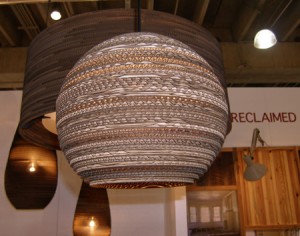
Other lighting that featured recycled material came from the company graypants. Their line is called “SCRAPLIGHTS™ –responsibly reimagining cardboard boxes”.  According to their brochure, SCRAPLIGHTS are made from salvaged cardboard and non-toxic adhesive. Because they use the boxes as is, they have a great natural look, similar to wood in tone. The hanging fixtures come in really fantastic shapes and sizes.

Using the same material, CartonPlanet comes up with a whole other animal. Their cardboard is less natural looking and is taken to the next level. They wax lyrical about the humble  material-

Cardboard is a symbol of revival.  It is fallible but indestructible, and at the same time it can surprise us with its obedience and persistence over and over.

Their lights are lovely but the fun doesn’t stop there- they have great furniture as well, made from recycled cardboard- coffee tables, chairs, sofas and shelving.

And for more recycled material lighting fun- I met Bao-Khang Luu when I was in the Sustainable Entrepreneur program at FIT.  He was making “upcycled” lamps from discarded materials.  The process of upcycling is described on the website for his company, Relevé Design:

When we’re done with magazines or plastic bottles we usually throw them away. Sometimes we reuse them. Other times we recycle. Recycling actually downgrades the material. For instance, the quality of plastic lessens each time it’s recycled. Different types of plastics and impurities get mixed together, weakening the plastic. Fortunately, there’s a better way to deal with waste, and that’s upcycling.

…Upcycling is an eco-friendly way of repurposing, because it only uses unwanted and discarded materials and transforms them into something new, desirable, and more valuable….In our case, we save six-pack rings from being dumped into a landfill or downcycled into low quality plastic, and we make them into new, fabulous lighting.

Bao has an amazing line of pendant lamps made from 6-pack plastic holders. And he is ever forthcoming with fantastic ideas for repurposing, check out this intriguing metal lamp spotted on his website, made from an easily recognizable commodity.

ICFF Snapshots

Comments Off on ICFF Snapshots Written on May 30th, 2012 by
Categories: Decorating Ideas, Olive Design
Tags: , , , , , , , , ,

Last week, I made the yearly pilgrimage to ICFF (the International Contemporary Furniture Fair), to see what is new and noteworthy.  The booths were incredible, the products lovely, I will devote a separate entry for the lights, as there was too much to cover in one short blog.  It was so incredibly visually intense.   There were a lot of international companies at the fair.  I am guessing that the cost of showing at one of these behemoths is astounding so you don’t get as much of the local variety and scrappy startups as at a local show.

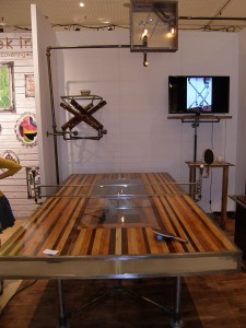
Olive DesignThat being said, totally loved Akke functional art ping pong table with what looked like a bowling alley surface, with steel pipe legs and a lighted glass inset. I don’t even play ping pong and I was ready to roll with this piece, I just loved the industrial look to it.  Akke is based in Huntington, New York, owner Axel Yberg’s hometown.Olive Design

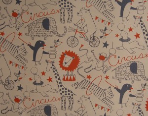
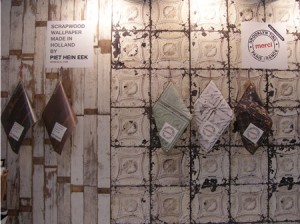
There were a number of wallpaper companies doing interesting patterns with small runs.  I liked Lobo Loup and Juju Papers, both were very playful.  Lobo Loup describes themselves as Wallpaper for the Modern Family and featured sophisticated kid friendly prints.  I was also intrigued by the scrap wood wallpaper by Piet Hein Eek, made in Holland.  There were equally convincing papers simulating concrete wallpaper, tin ceiling and other textures.Olive Design

Olive Design

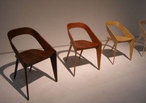
For classic good looks, I admired this chair by John Ford, shown in different woods.  It was beautifully made and the museum style presentation really showcased the minimal lines.

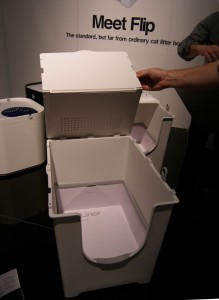
While I went to the show expecting great furniture and hopefully sustainable options (see next blog for lights made from recycled products!) I was not expecting to stumble on… the next thing in kitty litter boxes.  Nice that someone took the time to re-think this design and household issue.  Modko presents the “Flip”- it is an inverted version of the covered cat box, with a fold-back top for easy access, paperboard liners that are easy to remove (and treated for water-tight, no leak use).  There is a handy spot to hang the poop scoop as well.

Olive Design

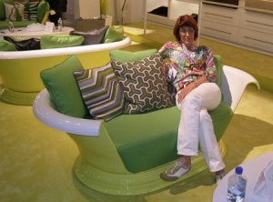
Lastly, was inspired to rest when I found the seat that best matched my outfit…you’ve heard of tub chairs?  These retrofitted pedestal tubs were so much fun.  It was a Kohler plumbing display- with Jonathan Adler colors and prints.  As that pairing seemed unusual I checked it out online.   Zack Cohn describes the partnership on psfk.com

Olive DesignCelebrity designer Jonathan Adler recently teamed up with Wisconsin-based home appliance brand, Kohler, to introduce a new line of colorful sinks for the kitchen and bathroom. The collection, which made its debut at the 2012 International Contemporary Furniture Fair, explores the question of the impact color can have amidst the white, ‘sterile’ space that traditionally defines a bathroom and kitchen.
Next week’s post will show pictures of some very cool lighting.  There will be sustainable and recycleable materials in lamps and hanging fixtures.  For a sneak peak, check out Gin Art & Design.


Container Gardens

Comments Off on Container Gardens Written on May 16th, 2012 by
Categories: In the Garden, Olive Design
Tags: , , , , ,

Brooklyn DesignOnce spring hits, you see lovely container gardens everywhere; the window boxes and planters, the fabulous colorful pots on porches and paths.  I asked my gardening expert friend Tracey Hohman how she makes them so beautifully and she shared her tips and tricks. She recommends starting the early plantings with hearty plants, like Pansy.  I always know it’s time to set them out when I see them on her porch!  For true summer plants the rule of thumb is to wait until Mother’s Day.

Brooklyn Design

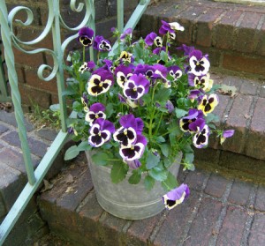
For showy blooms and great display, you can get a lot of drama planting a big pot with all the same flower, all same color, planted close together.  Tracey shows a pot of pansies that were just ending their spring run. Alternatively you can mix colors of the same flower that co-ordinate with each other, in the same pot.

The Container How-To

  1. Start with a nice sized container or pot.  Tracey shares my enthusiasm for clay pots- (I like the glazed ceramic ones as well, saw the most beautiful ones at Lapide Plants in the Terminal Market).  You want them deep enough so that they don’t dry out quickly.  One of the challenges of container gardening is keeping them watered!
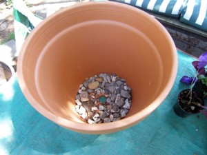
  2. Add gravel or rocks to the bottom to provide drainage.  I follow my thrifty mom’s lead and recycle broken clay pots for this purpose, mixed with gravel. People are always asking me why I keep a bag of broken pots in the garage…Brooklyn Design
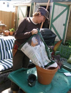
  3. The dirt on Dirt:  Don’t recycle last year’s dirt without adding back some nutrients in the form of compost or garden manure.  Tracey favors “Professional Potting Soil” that she picks up at Shannon’s Nursery on Fort Hamilton Avenue.  You can use this straight out of the bag, but if you have some dirt in pots from last year and want to use it, remediate the soil with at least a third of fresh stuff and/or compost. Helpful Hint- do this whole operation on a tarp or plastic sheet- you can easily clean up later by dumping the spillage in the yard or garden.
  4. Fill the dirt only part way up in the pot, leaving room to set the plantings in with their pot dirt.  You want to eventually have the whole thing about ¾”-1” below top rim of pot, so that water stays in when you water the pots.
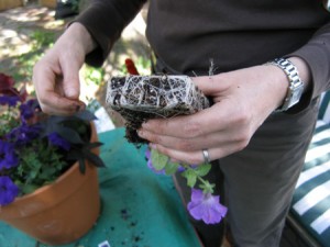
  5. Arrange them in the container, still in the nursery pots.  Taller plants should be placed in the back with trailing plants in the front.  You want to really plant them densely, to look abundant and lush.  Trim off any withered leaves or stems now. Once you have them arrange nicely, take each one out of the nursery pot and before you place it in the dirt, work the roots a little, loosen them up so they are not “rootbound”.
  6. After you place them in, tuck more of the dirt in so that it fills the pot up to the 3/4” below the rim. Plants should be closely spaced, the dirt filled in between the plants where there is any gap and all around the edges of the pot. Pat dirt down lightly- and water when you are done. As an optional last step, you can add some mulch to the top of the planter on any exposed dirt- it helps retain moisture and looks more “finished”.Brooklyn Design

Plant suggestions

When considering your plant selection, you want to determine the light where they will be situated.  6 hours or more is “full sun” 4-6 hours is “partial sun”, anything less is shade.

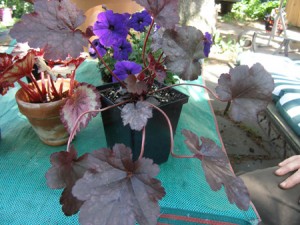
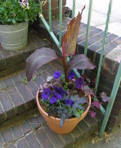
Brooklyn DesignFor the container we just did, Tracey used a variety of types of plants, mixing annuals, perennials- and houseplants.   Send your weary potted plants to Summer Camp on the porch!  They will be invigorated by the sunny porch living (provided you remember to regularly water) and in the fall, you can repot and bring the plant back inside.  It’s a thrifty way to add more variety to your porch plantings. For height, she used a canna, and a classic annual, Petunia, for the shot of hot color.  The house plants she mixed in were Begonia Rex and Oxalis. The perennial was Heuchera  “Plum Pudding”.  There was a red sweet potato vine that will eventually trail down the side of the planter once it gets situated.  All the foliage plants selected had similar merlot coloring, but different shapes and textures, for interest.

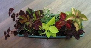
Brooklyn DesignTracey also showed me a great planter she had put together for the porch railing.  It had a variety of different colored coleus for a shady area, and for the “trailer” a pretty white flower on a vine, called “Euphorbia Diamond Frost”.  I am midway through making my porch planters, having refurbished and painted the wooden containers from last year (courtesy of one of our film shoots).  I put coleus in one as per Tracey’s suggestions about grouping a single type of plants, and in the other I plan on moving the philodendron outside for some summer fun, still “browsing” through the indoor plants looking for something to give it some height.

Brooklyn Design

Remember to water, often, especially when we get into the really hot season- if you are traveling on vacation a great idea to get someone to look after the plantings.  As a final note, I would mention that my container plantings in the past have proved endlessly fascinating to the resident squirrel population, they seem convinced somehow that they have something buried in there from last year and I used to be out sweeping up the rummaged dirt every morning, rescuing broken plants.  Cayenne pepper, sprinkled liberally discouraged this practice.

Happy planting.

Appliances

Comments Off on Appliances Written on May 9th, 2012 by
Categories: Olive Design, Olive Green
Tags: , , , , , , ,

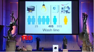
The other day someone from one of my Sustainable Entrepreneur Groups posted a great Ted Talk called “Hans Rosling and the Amazing Washing Machine”.

In it, global heath expert Hans Rosling recounted the day his mother and grandmother, after scrimping and saving for years, used their new washing machine for the first time.  It was a huge step up from heating the water over a wood fire and performing the weekly chore of washing clothes by hand.  He chronicles consumption and “the washing machine class”, noting that women of every class, in every society, want a washing machine, as it falls on them alone to do this backbreaking chore.  Rosling posits the case that the washing machine may be the greatest invention of the industrial revolution.  The video informs about consumption in a humorous and engaging manner.

But consumption polemics aside, the appliance that I find so many women talk about and on which they wax lyrical, is the vacuum.  How many times on our local list serve have we heard someone ask for recommendations for a brand, model, or source- and get a host of enthusiastic responses.  I have had a good relationship with my vacuum go-to guys in Park Slope, Brooke’s Appliances for years, and continue to loyally buy my vacuums there and have them serviced as needed. On their advice I bought the best ones I could afford.

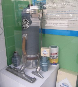
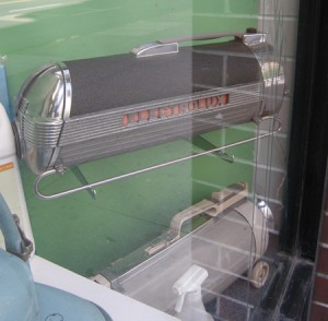
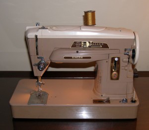
VacuumWhen my favorite brand started delivering shoddy goods, I felt let down. The last two of my favorite brand’s machines I purchased were disappointing in performance and durability.  I expect that when I pay more for something, the trade off will be that it lasts longer and performs better. While the machine was not inexpensive, the plastic wheel fell off in a month, clips broken and unfixable, the wand broke, the suction was ok but not fabulous enough to make me overlook the cheap plastic parts breaking with light use. How many of us go home to visit our parents and see the 50 year old Electrolux in the closet? Mom may like the newer brighter lighter weight canister vac better, or prefer an upright with the lighted front- but the Electrolux is still going strong.    I hate to buy anything that I know will break down quickly, despise the notion of planned obsolescence, and “throw away “ goods.  My 1954 sewing machine is serviced regularly and is a powerhouse.  Ok, so it doesn’t do buttonholes automatically and I will never figure out the ultra-low tech do-hickey that they claim will do them- I’m okay without all the bells and whistles.  My mom had given me her 1954 sewing machine years ago, and upgraded to a newer model- and has been through 4 machines since.  I kept her New Home going until the early 80’s until the overhaul on it cost more than it was worth, and replaced it with a Singer of the same vintage.  1954, apparently was a good year for sewing machines.Olive Design

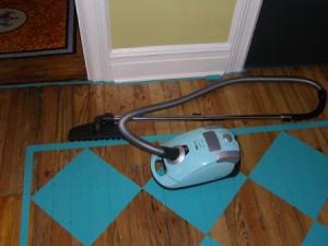
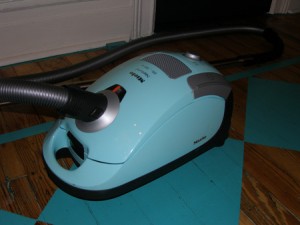
Olive DesignHaving decided to jump ship from my current vacuum brand, I cast my eye on the much-touted Miele; this little aqua blue number that (of course) was just the right color.  Only to find this particular color had been discontinued by the time I had made up my mind to invest in what I hoped was a better quality machine.  It was the rave reviews of every woman I know who owned one that got me interested in purchasing one, but of course it was the color that sold me. The Brooke’s Appliance guys went searching, and found me what they claim may be the last still-new-in-box aqua blue Miele available on the market.  Thus far I am in awe of the performance and the heft of the parts; wands and heads snap together with a resounding click, there is no sense of impending breakage, it’s like driving a luxury… vacuum.  I justify my consumerism by investing in a product that will not need replacing within a year.  I am passing on my old machine to someone who needed one, replacing the wheel and taping the faulty wand, and wishing them good luck with it.  If it’s broke, then fix it.  If it can’t be fixed it just may be too temporary for me.Olive Design


Tangerine Dreaming

Comments Off on Tangerine Dreaming Written on April 5th, 2012 by
Categories: Olive Blog, Olive Design
Tags: , , , , , ,

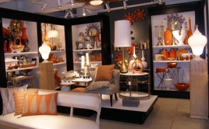
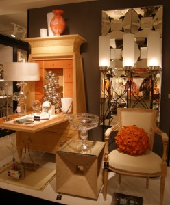
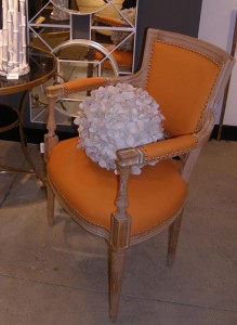
Robert Wilson Associates ShowroomI was doing some furniture shopping at the 200 Lex building last Friday and I was reminded anew about the power of color to move people. I saw a lot of Spring colors and plenty of the new NOW color.

For some time I have been getting glimpses of this really powerful reddish orange, first bits and pieces and then more and more and then Whammo!Robert Wilson Associates Showroom

From the Pantone folks:

Pantone Reveals Color of the Year for 2012:

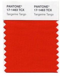
PANTONE 17-1463 Tangerine Tango

Dance into the New Year with this vivacious and appealing reddish orangeTangerine

CARLSTADT, N.J., Dec. 8, 2011 – Pantone LLC, an X-Rite company (NASDAQ: XRIT), and the global authority on color and provider of professional color standards for the design industries, today announced PANTONE® 17-1463 Tangerine Tango, a vivacious, enticing hue, as the color of the year for 2012.

Tangerine Tango, a spirited reddish orange, continues to provide the energy boost we need to recharge and move forward.

For more than a decade, Pantone’s Color of the Year has influenced product development and purchasing decisions in multiple industries, including fashion, home and industrial design, as well as product packaging and graphic design.Robert Wilson Associates

This new color it seems is everywhere. One of the showrooms I visited, Global Views, has gotten the message loud and clear. Their showroom was an homage to this delicious color. But it becomes, as Pantone tells us, a driving force. Not only do I see it in the home furnishings and apparel market, but as a back drop color in ads, like Gap Kids.

I have always been excited about color, as an artist I loved mixing it and creating with it, and as a textile designer creating various colorways for different patterns was always a welcome challenge. When I worked at Gear with Raymond Waites, I remember him telling us how important color was in selling the fabric.  No matter how fantastic the design, it was the color that moved the consumer. “90% of the appeal is the color” I remember him telling us in a design meeting.

Spring Colors

As an interior designer I know firsthand how much change a coat of paint can bring in a room. Color shifts things in a major way, sets mood and tone. Just a few nights ago I ran into a client from a few years back who told me she still loves the custom color I made for her dining room.

Bloomingdales Window

Our appetite for color seems to change seasonally. In addition to the new NOW color of tangerine, I see the Easter colors being trotted out as well. They remind us of Spring and are fresh and welcome after a dreary winter. They come to us naturally in the flowering trees and early spring flowers. I am ready to bring the flowers inside and enjoy the Season’s color in my home, while wearing my Tangerine Tango t-shirt.


Suitcase Storage

Comments Off on Suitcase Storage Written on March 6th, 2012 by
Categories: Decorating Ideas, Olive Design
Tags: , , ,

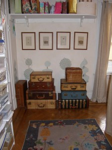
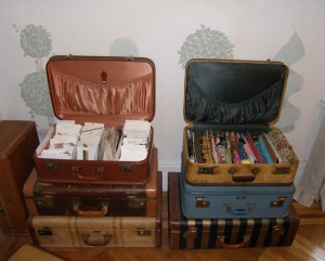
Studio StorageI always get comments on my storage solution in the studio.  I stack vintage suitcases I have collected and have easy access to my endless caches of “stuff”. Lengths of trim, samples of passementerie, vintage fabrics, carpet samples….easily and neatly stowed in  plain site.  I always thought I would get fancy and hang luggage tags on them to identify the contents, but never get around to that level of Martha-ness.Open Suitcases

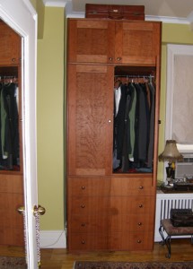
I like the vintage suitcases with fabric and leather trim best, but also admire the antique leather ones which are often such great colors.  I gave one to my friend Maritza to put on top of the custom Armoire that we had built for her bedroom.  It was the perfect match to the cherry stain of the Armoire.  In order to make her room look better, we needed to stack a dresser, closet and storage cubby into one unit.  By using the suitcase on top, we managed to wring every last bit of storage space from that corner.Armoire with Suitcase


In Praise of Checkerboards

Comments Off on In Praise of Checkerboards Written on January 30th, 2012 by
Categories: Decorating Ideas, Olive Design
Tags: , , , , , ,

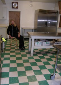
I had occasion to visit  an American Legion post this weekend, for a memorial for my father.  When I went down to the service kitchen I was impressed by just how cool it was- all because of the incredibly fabulous checkerboard floor.

Checkerboard Kitchen Floor

I took a shot of the floor with Maureen, one of the lovely Auxillary ladies who was helping with the food for the service.  I love the way a checkerboard floor, made from even the most mundane material (linoleum or paint), can transform a space  into something fun and dynamic.

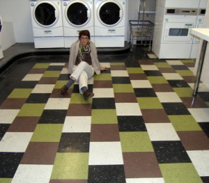
The laundry room floor photo was taken while I was visiting a friend.

Checkerboard FloorI was impressed by the great color scheme (it matched my scarf perfectly), how the time was taken to make these inexpensive tiles in a utility room return more than their money’s worth in great design.


Designs on Wood

Comments Off on Designs on Wood Written on January 17th, 2012 by
Categories: Decorating Ideas, Olive Design, Olive Green
Tags: , ,

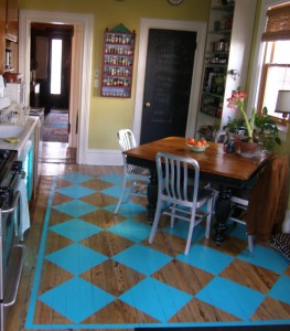
After a film crew unceremoniously sanded off my teal blue kitchen floor, with its aqua checkerboard, I was left with a somewhat unlovely- but natural-looking wood floor.   I didn’t miss the fabulous teal color I had painted as much as I did the pattern on top.  So I designed a checkerboard ”rug” to drop on top of the polyurethaned wood.  It gives me the pattern fun, but is easy to maintain.  When  the next film crew that used my kitchen (see it in the pilot show of “a Gifted Man”) damaged the floor- it was easy to paint back in a few tiles without re-doing the whole thing!

As the floor was an awkward shape, I designed an area with the size squares that I had in mind and positioned it on the floor with a same-color border all around.  It makes it way easier than dealing with the awkward edges of the room that do not lend themselves to extending a checkerboard across the whole thing.

I took the opportunity, when the floor was redone, to switch to a water based finish.  With today’s new technology the finish is just as sturdy as the oil based variety, dries faster and is way less toxic than its alkyd brethren.

I have used natural floors as the backdrop for other floor patterns, it makes a great textured ground and hides blemishes and mess better than a plain two-colored pattern.